Analytics Overview
This article explains how Analytics helps you understand how customers interact with your products inside the configurator. You track views, interactions, conversions, and revenue for each product, with flexible filters and visual reports that adapt to your subscription plan.
You learn how to read KPI metrics, analyze trends over time, compare periods, and identify top-performing products, options, and dealers. This gives you a clear picture of what drives engagement and conversions, and where to optimize the product experience.
Overview
Analytics gives you a clear view of how customers interact with your products inside the configurator. You track views, engagement with 3D and AR features, add-to-cart actions, and completed orders across all products or selected ones.
All metrics update in real time based on active filters, allowing you to analyze performance by product, period, and dealer. This helps you understand what drives engagement, identify drop-off points, and optimize product configurations for better conversion.
👉 View Analytics: https://app.amaspace.co/analytics
How Analytics Works
Analytics tracks user behavior across the entire product configuration journey. Every interaction inside the configurator contributes to aggregated metrics and visual reports.
Data is organized around three core ideas:
- Actions — views, interactions with 3D/AR, add-to-cart events, and orders
- Scope — all products or a selected set of up to three products
- Time — configurable date ranges based on your subscription plan
The analytics backend provides two types of data:
- Timeseries data for building charts over time
- Aggregated KPI data for current and previous period comparisons, funnels, and top lists
Available historical data depends on your subscription tier. Some advanced analytics features and longer date ranges require higher plans.
👉 See Subscriptions to learn more about plan limits.
Filters and Scope
All analytics sections use the same set of filters. Any change you make applies instantly to KPIs, charts, funnels, and tables.
Date
Select the period you want to analyze:
- 7 days
- 30 days
- 365 days
- Custom range
Available date ranges depend on your subscription plan.
👉 See Subscriptions to learn more about data availability.
Compare
Use Compare to evaluate performance changes over time.
Available options:
- No — show only the selected period
- Last period — compare metrics with the previous equivalent period
For example, when you select 7 days, Analytics compares results with the previous 7 days and highlights changes in values and percentages.

Scope (Products)
Scope defines which products are included in analytics.
You can choose:
- All products — default view with aggregated data
- Selected products — choose from 1 to 3 products for focused analysis
Some sections, such as Top Products, are available only when All products is selected.

Dealer
The Dealer filter is available in dealer mode.
You can:
- View analytics across all dealers
- Filter data by a specific dealer
When a dealer is selected, all analytics update to reflect only that dealer’s activity.

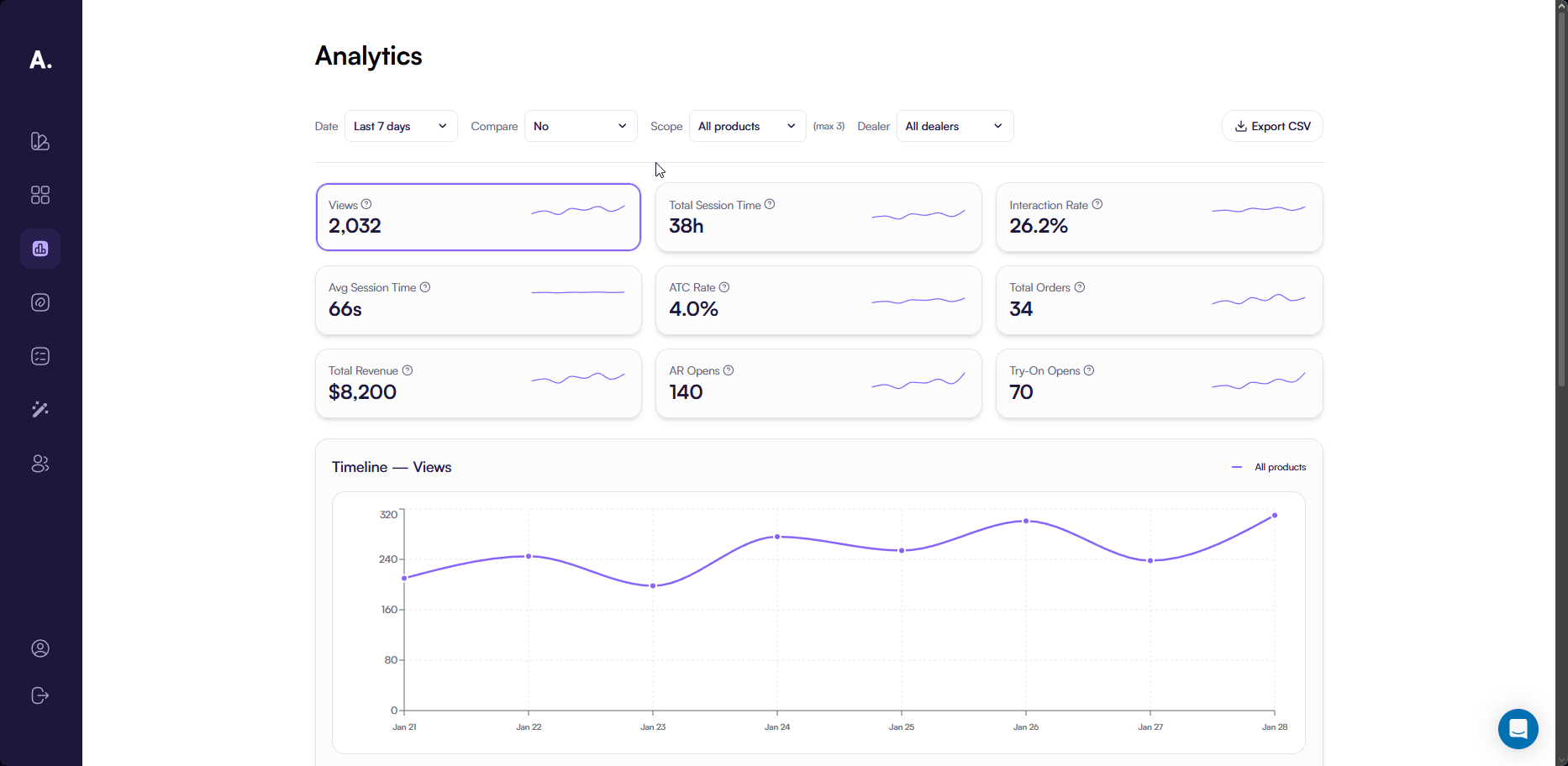
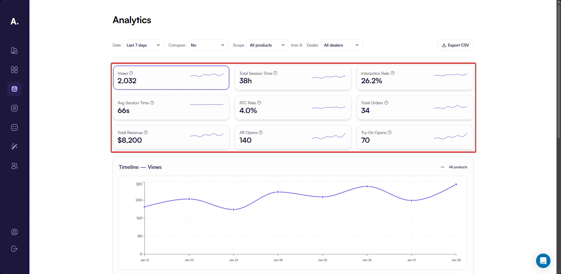
KPI Metrics
The KPI Metrics section gives you a quick summary of how your products perform within the configurator. It helps you understand overall engagement, conversion, and revenue before exploring detailed charts and breakdowns.
Each KPI represents a specific aspect of user behavior or business performance. For every metric, you can review its value for the selected period and, when Compare → Last period is enabled, see how it changed compared to the previous equivalent period.
This makes it easy to track progress, identify growth or decline, and spot metrics that require deeper analysis.
Available KPIs
You can analyze the following KPIs:
-
Views Shows how often product pages are opened, giving you a baseline for product visibility and interest.
-
Total Session Time Reflects how much time users spend exploring your products in total, helping you understand overall engagement depth.
-
Interaction Rate Indicates how frequently users interact with 3D and AR features, such as rotating models, zooming, or opening AR view.
-
Avg Session Time Shows the average time users spend per session on product pages, useful for comparing engagement across products.
-
ATC Rate Represents how effectively product views convert into add-to-cart actions.
-
Total Orders Displays how many completed orders include your products, connecting engagement to actual purchases.
-
Total Revenue Shows the revenue generated from completed orders, allowing you to measure financial impact.
-
AR Opens Highlights how often users open products in augmented reality to view them in a real-world context.
-
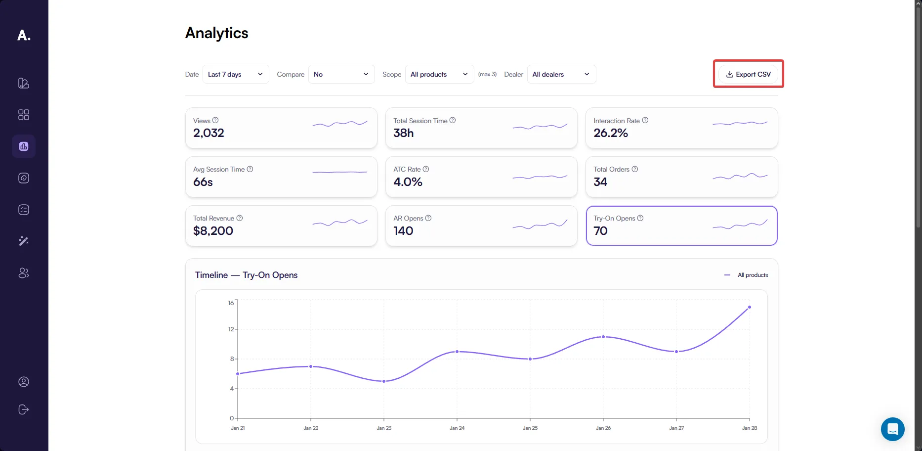
Try-On Opens Shows how frequently users activate virtual try-on to visualize products on themselves.
All KPI values automatically update based on the selected date range, product scope, dealer, and comparison settings.
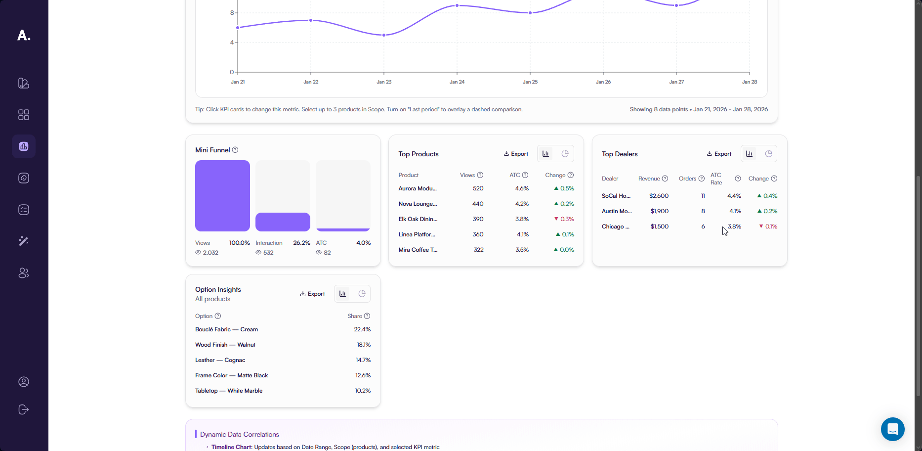
Timeline Chart
The Timeline Chart provides a detailed view of how a selected KPI changes over time.
This chart appears below the KPI grid and automatically reflects the currently selected KPI. When you click a different KPI card, the Timeline Chart updates to show the full trend for that metric.
The Timeline Chart helps you:
- Identify peaks and drops in activity
- Understand daily or weekly behavior patterns
- Compare performance across different periods
All active filters, including Date Range, Compare, Scope, and Dealer, apply to the Timeline Chart.

Exporting KPI Data
Export CSV
You can export KPI data at any time using the Export CSV button.
The exported CSV depends on the currently selected KPI and includes:
- Date-based values for the selected KPI
- Data for the chosen date range
- Results filtered by the active Scope and Dealer
Comparison data from Compare → Last period affects on-screen metrics but is not included in the exported file.
This export is useful for offline analysis, reporting, or sharing raw KPI values with your team.
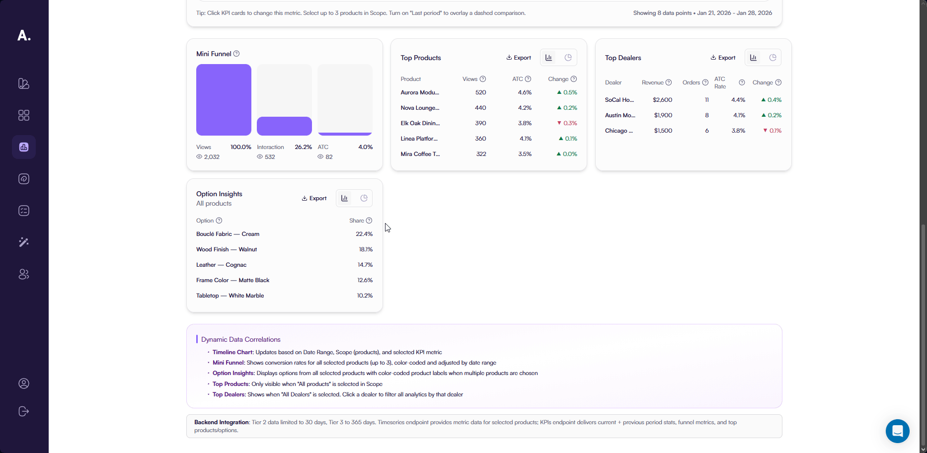
Mini Funnel
The Mini Funnel helps you understand how product views translate into engagement and add-to-cart actions.
It shows how many sessions viewed a product and how many of those sessions continued to interact with 3D or AR features or added the product to the cart.
The funnel includes three steps:
- Views — total sessions where a product page was opened
- Interaction — sessions where users interacted with 3D or AR features after viewing the product
- Add to Cart — sessions where the product was added to the cart
For each step, Analytics displays the number of sessions and the percentage relative to product views. This makes it easy to see what share of viewers engage with the product and what share shows purchase intent.
The Mini Funnel supports analysis for up to three selected products. When multiple products are selected, each product is color-coded to make comparison clear.
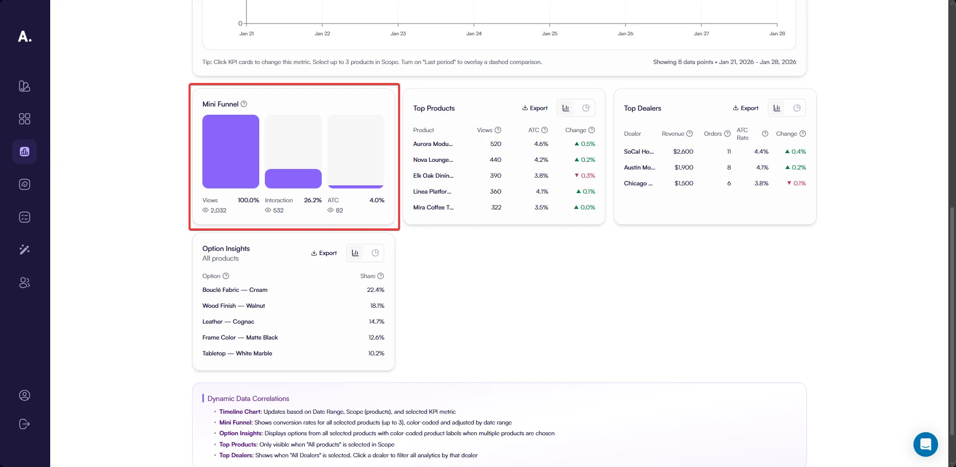
Top Products
The Top Products section highlights the five best-performing products across your catalog.
This section is visible only when Scope → All products is selected.
Analytics shows up to five products with the strongest performance based on user activity and conversion.
For each product, you see:
- Product — the product name; clicking it applies a product filter
- Views — how often the product was viewed
- ATC Rate — how effectively views convert into add-to-cart actions
- Change — difference in ATC rate compared to the previous period
This section helps you quickly identify which products attract the most attention and convert best.
Export and Visualization
You can export the table using Export CSV.
You can also switch to a Pie Chart view, which visualizes how each of the top products contributes to total views as a percentage.

Top Dealers
The Top Dealers section helps you understand how different dealers contribute to overall performance and conversions.
This section is available only in dealer mode and appears when Dealer → All dealers is selected. Analytics displays up to five dealers with the strongest results for the selected period.
For each dealer, you can review:
- Dealer — the dealer or partner responsible for the sales activity
- Revenue — the total sales value generated through this dealer
- Orders — how many purchases were completed by this dealer’s customers
- ATC — how often customers interacting with this dealer add products to the cart
- Change — how the add-to-cart performance changed compared to the previous period
This overview makes it easy to compare dealers, identify consistent performers, and detect changes in customer behavior across different partners.
Export and Visualization
You can export dealer data using Export CSV. You can also switch to a Pie Chart view, which shows the percentage share of total orders generated by each dealer among the top dealers.
Option Insights
Option Insights shows the five most frequently selected configuration options across the selected products.
This section focuses on options that customers choose most often, such as colors, materials, finishes, and similar configurable attributes.
Analytics displays up to five options, helping you understand which choices resonate most with customers.
For each option, you see:
- Option — the option name
- Share — the percentage of selections for this option compared to all option selections
When multiple products are selected, options include color-coded product labels for clarity.
Export and Visualization
You can export option data using Export CSV.
You can also switch to a Pie Chart view to visualize the distribution of option selections by share.