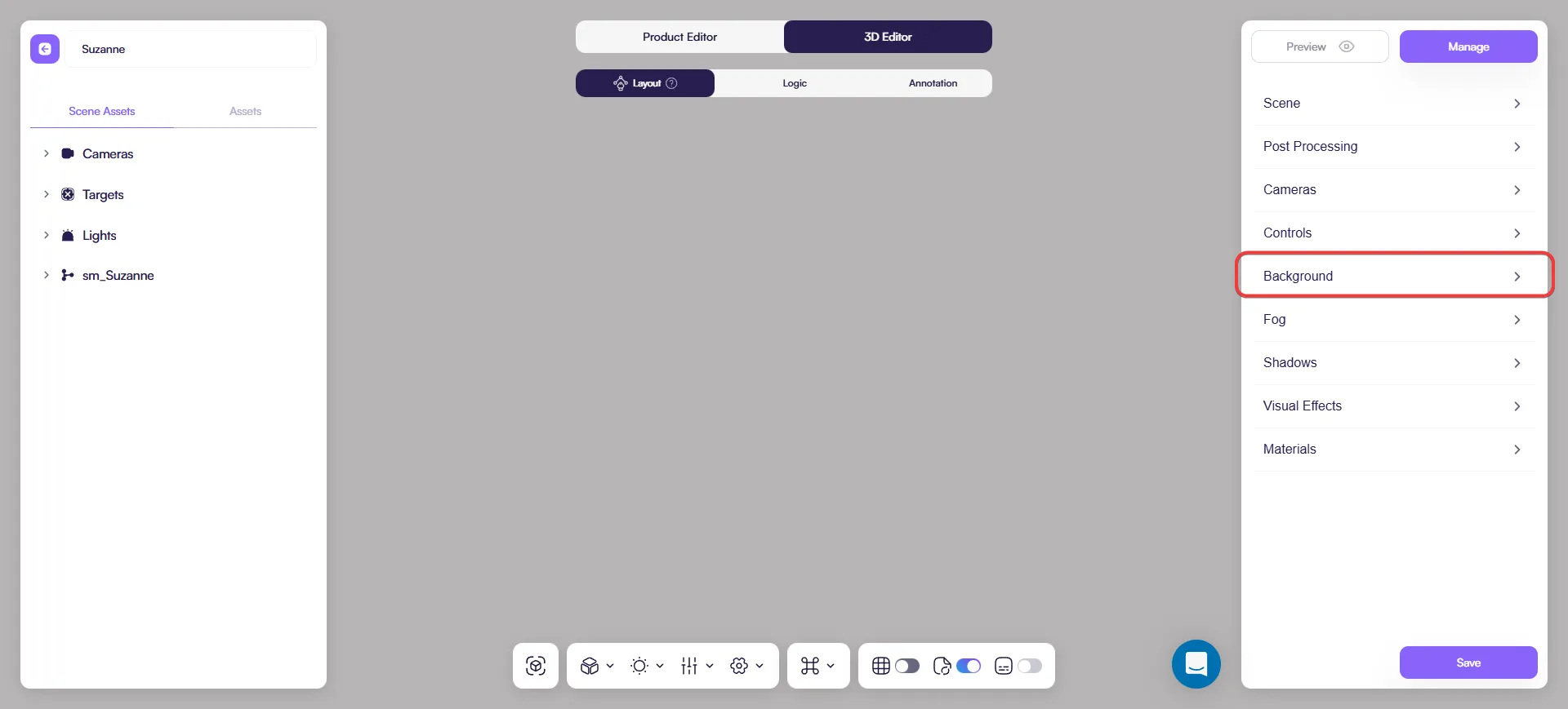
Background
Overview
Background controls what appears behind your product in the 3D viewer. It does not affect the model or materials directly, but it strongly influences contrast, readability, and overall focus.
Location: 3D Editor → Layout → Background
When to adjust the background
Adjust the background when:
- The product blends into the scene
- Materials or silhouettes are hard to read
- You prepare embeds, AR, or marketing previews
The goal is always clarity, not decoration.
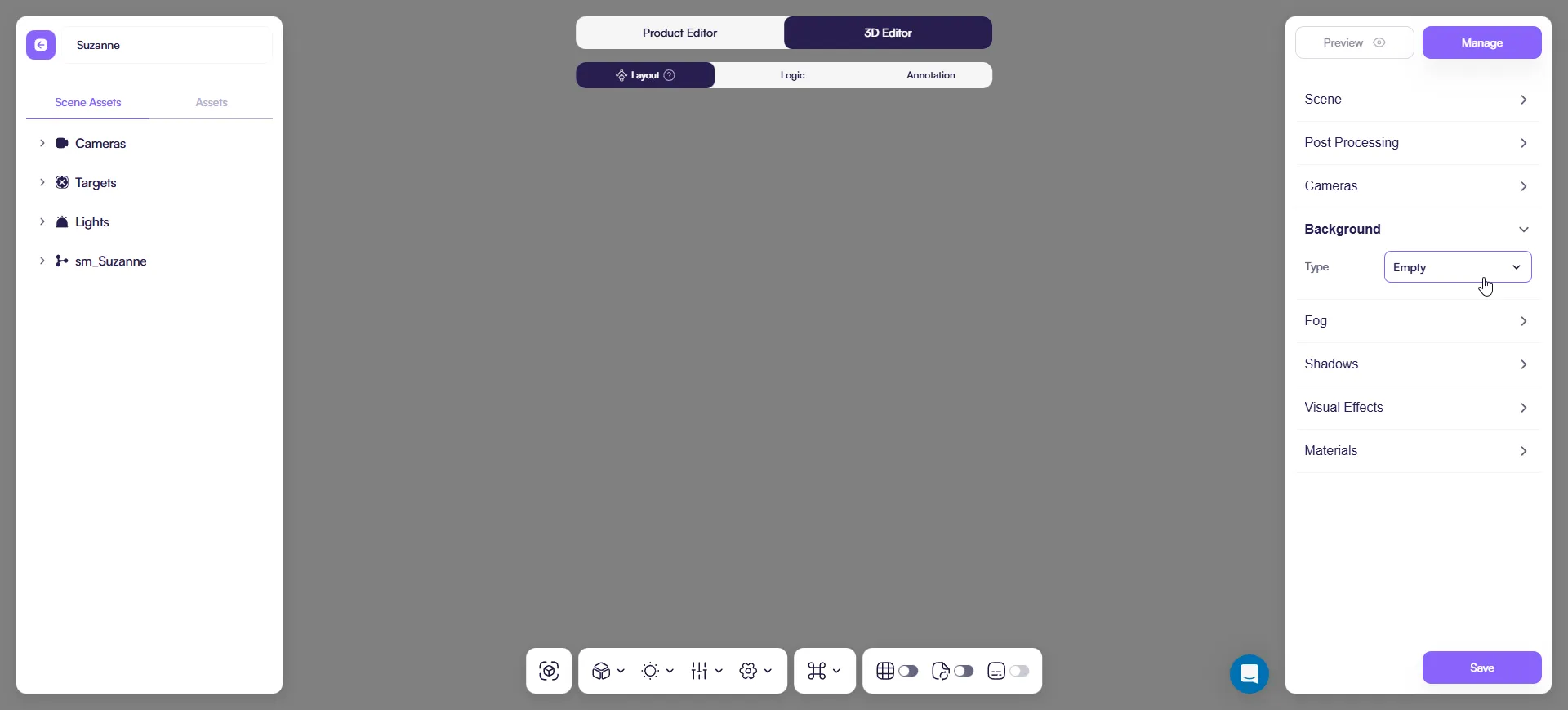
Background types
Empty (Transparent)
Removes the background entirely.
Use it when:
- you embed the configurator into a website and want the page background to show through
- you want a minimal, “no distractions” look
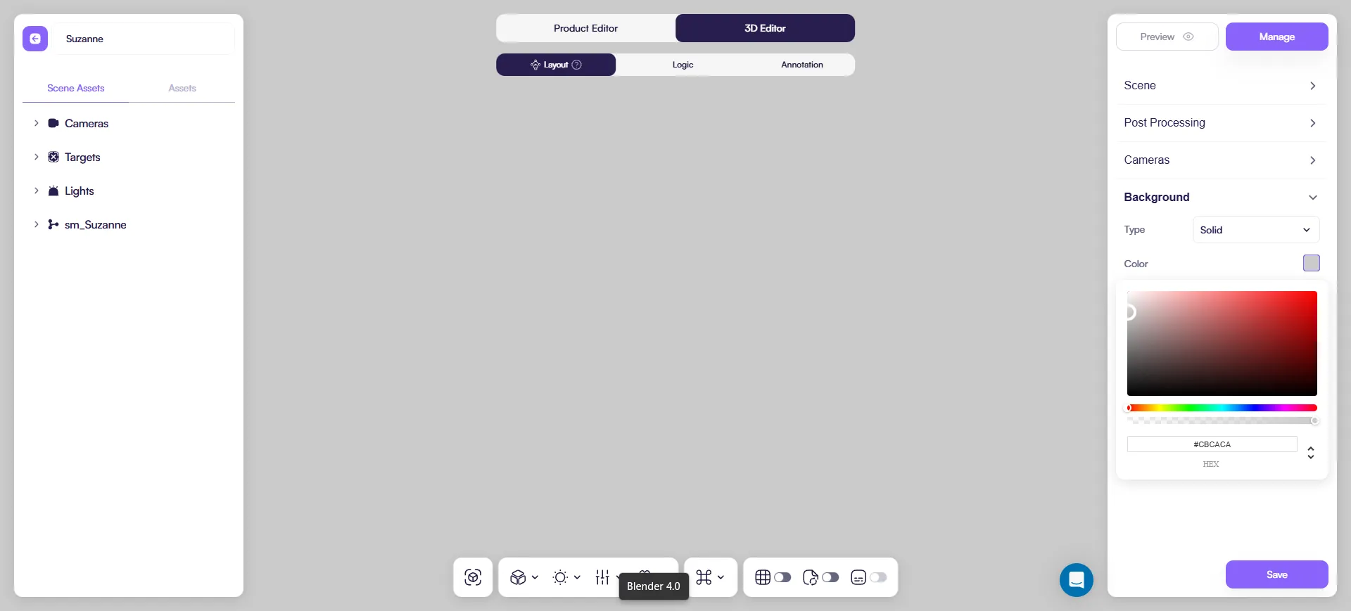
Solid color
Uses a single flat color.
Use when:
- You want a clean, distraction-free view
- You need strong product silhouettes
Neutral light gray or off-white works best in most cases.
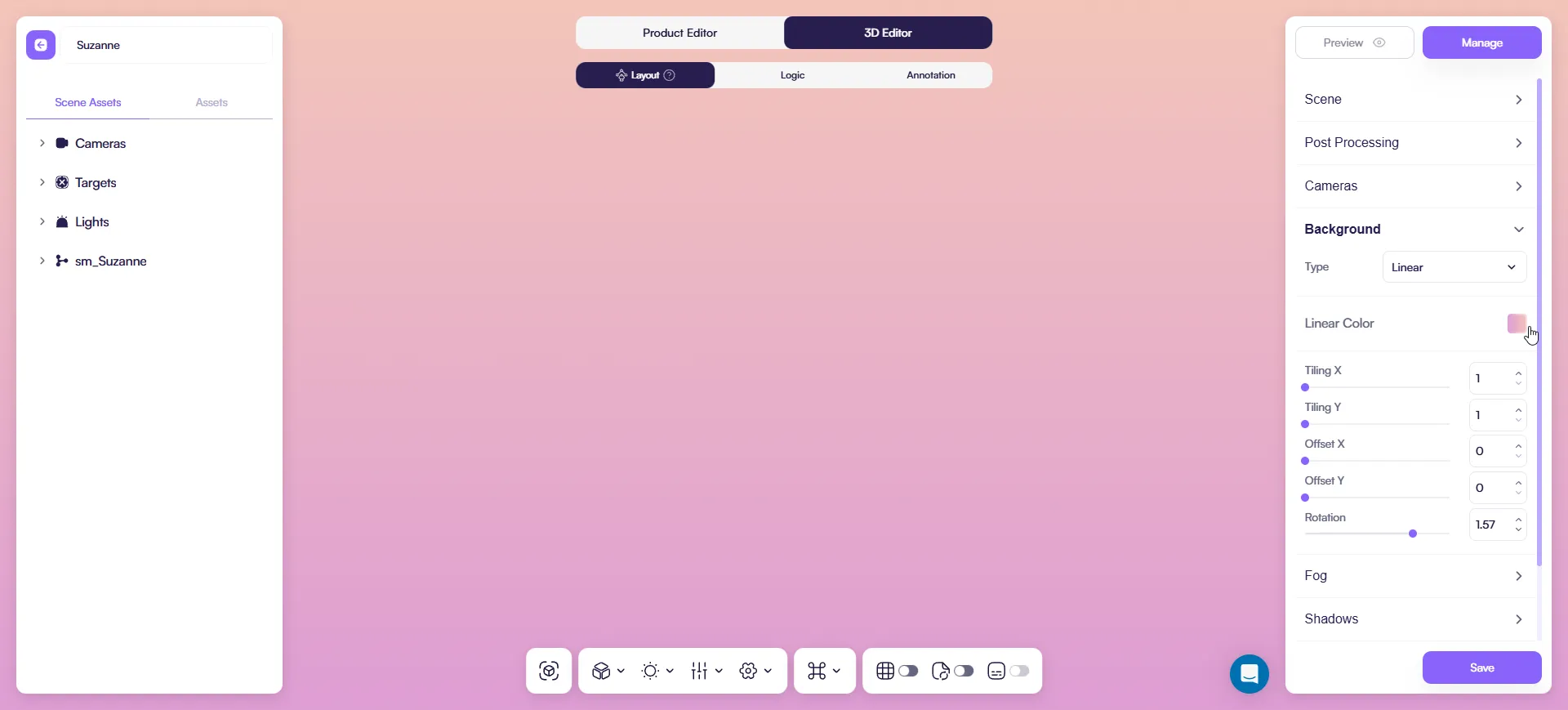
Linear Gradient
A smooth gradient that shifts in one direction.
Use it when:
- you want a bit of depth without adding visual noise
- you need a gentle background separation for the product
Controls you’ll see:
- Linear Color (pick the gradient colors)
- Tiling X / Tiling Y (pattern scale)
- Offset X / Offset Y (moves the gradient)
- Rotation (turns the gradient direction)
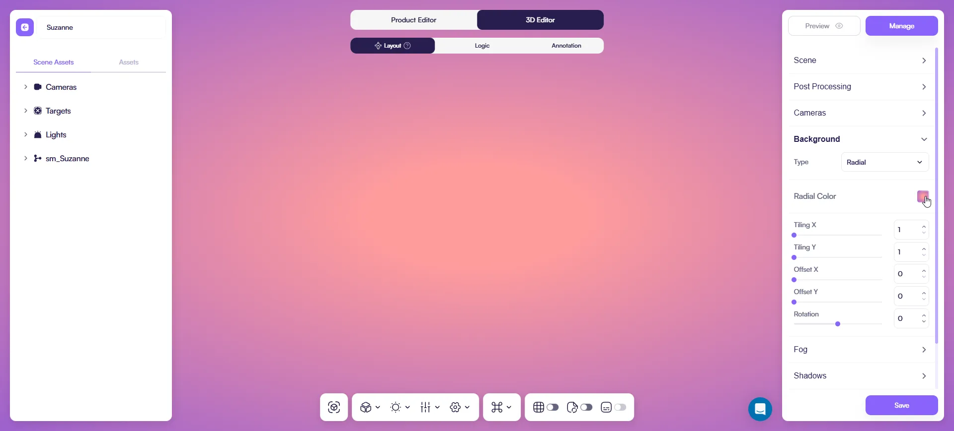
Radial Gradient
A gradient that spreads from a center point (soft “spotlight” feel).
Use it when:
- you want to subtly pull attention toward the product center
- you want a studio-like backdrop without an image
Controls you’ll see:
- Radial Color
- Tiling X / Tiling Y
- Offset X / Offset Y
- Rotation
Texture
Uses a static image as background.
Use when:
- Showing lifestyle or contextual scenes
Avoid busy images. They reduce product readability and increase visual noise.
Performance impact
Background choice affects performance:
- Best: Transparent, Solid color
- OK: Gradient
- Heavy: Image
For configurators and mobile devices, prefer simple backgrounds.
Quick setup
- Open 3D Editor.
- Go to Layout → Background.
- Choose the background type.
- Preview the product and check contrast.
If materials become harder to read, simplify the background.
Best practices
- Use the simplest background that keeps the product readable
- Avoid high-contrast or busy images
- Always verify readability on mobile