Creating themes
This article explains how to create and customize a theme for your products using the Theme Editor. You learn how to configure the sidebar layout, visual styles, loader, branding, and optional contact form to match your product experience.
By the end of this guide, you create a complete theme, assign it to products, preview it in the configurator, and save it for use across your catalog.
Create a new theme
Follow these steps to create a new theme in Theme Editor.
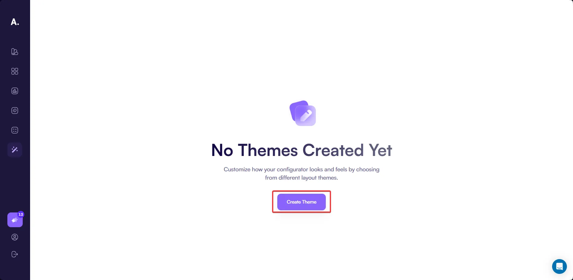
Step 1. Create a theme
Go to
👉 https://app.amaspace.co/theme-editor
Click Create Theme to start creating a new theme.
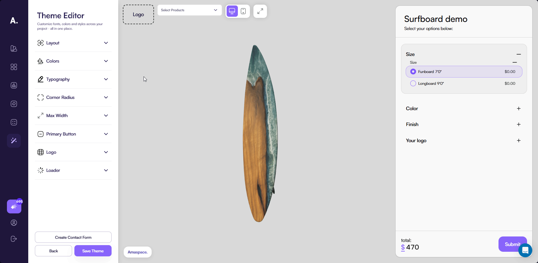
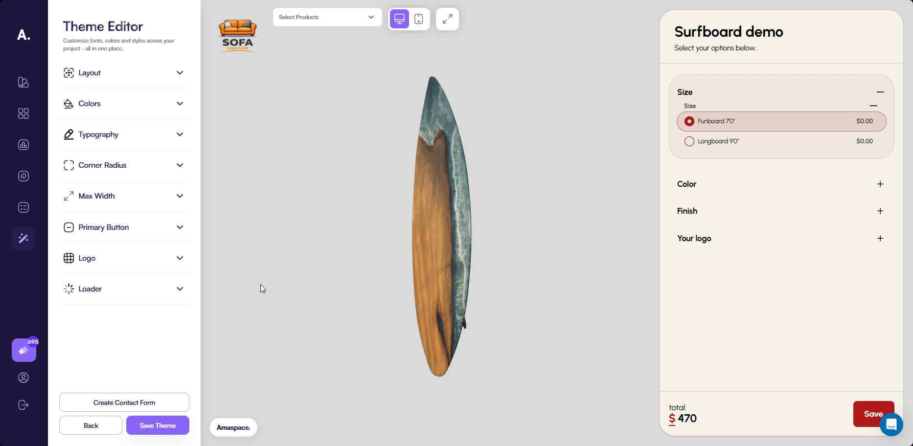
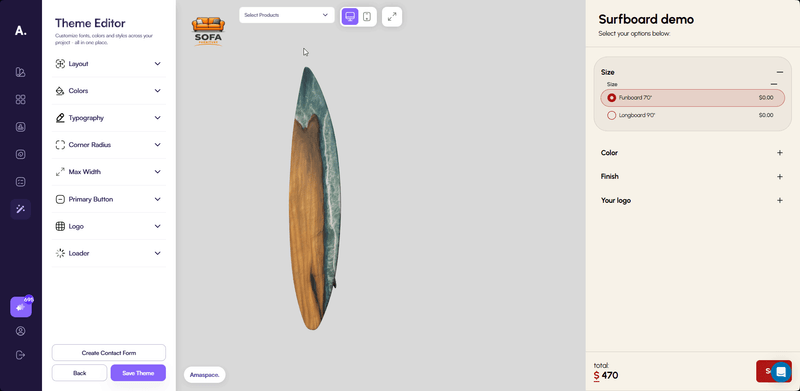
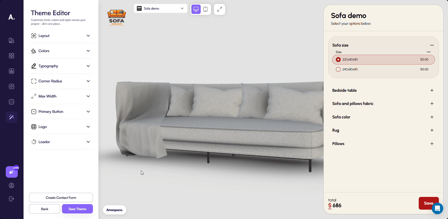
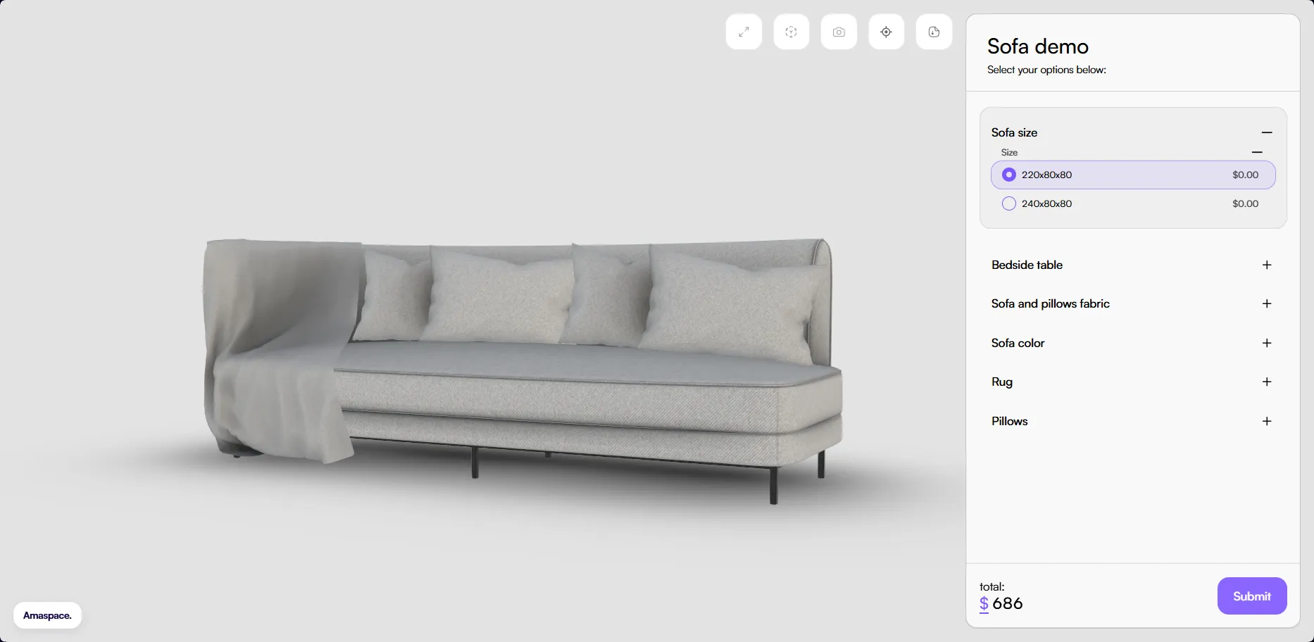
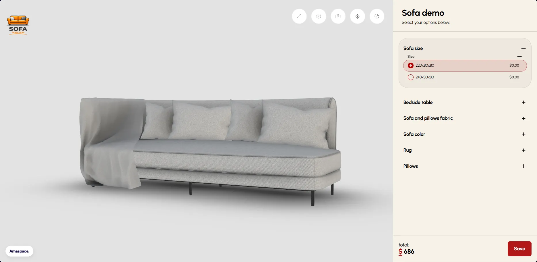
After clicking the button, the theme editor opens with a preview of the configurator. The preview includes a 3D canvas and a sidebar with configuration options and a submit button. All changes you make in the next steps are immediately reflected in this preview.
Step 2. Customize the theme
In this step, you customize how the configurator looks and behaves. Theme Editor provides several tabs that control the sidebar layout, colors, typography, branding, and loader. All changes apply instantly, allowing you to see the result directly in the configurator preview.

Layout
The Layout tab controls the structure and positioning of the configurator sidebar.
You can choose one of the following sidebar templates:
- Floating — The default layout. The sidebar has spacing around it and appears visually separated from the edges.
- Linear — The sidebar is attached directly to the edge of the screen with no spacing.
- Widgets — The sidebar is divided into sections (categories) and includes spacing around the layout.
- Hot-spots — A special layout designed for annotation-based configuration. Use this layout when you plan to display options as annotations instead of listing them in the sidebar. The sidebar shows only the selected options.
👉 See Annotations to learn more about how annotations work in the configurator.
You can also control where the sidebar appears by selecting the left or right side of the configurator.
If you select the Widgets layout, you can choose whether the price block appears at the top or bottom of the sidebar. By default, the price and submit button are shown at the bottom. This option is available only for the Widgets layout.
The Layout tab also includes the following options:
- Show selected options section — Displays selected options next to the sidebar. Disable this option to hide the selected options section.
- Show Amaspace branding — Controls whether the Amaspace watermark appears in the configurator.

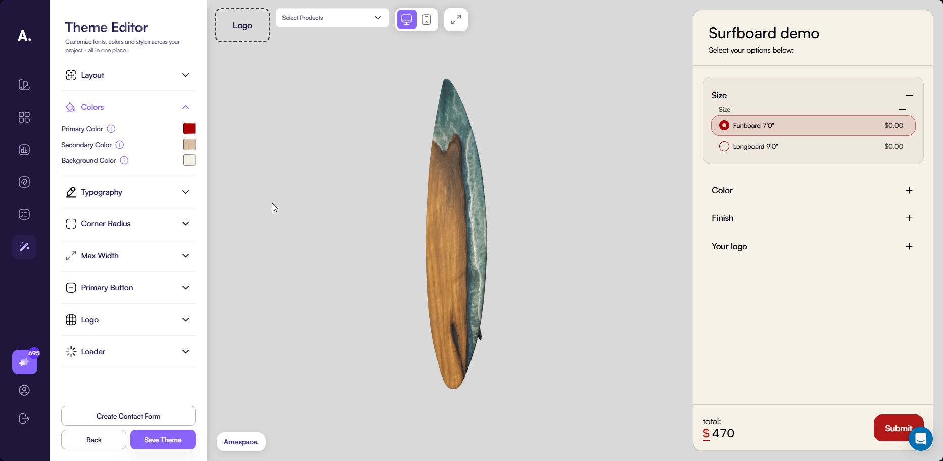
Colors
The Colors tab controls the main color scheme of the configurator. These colors apply across the sidebar, inputs, buttons, and other UI elements.
You can configure the following colors:
- Primary — The main accent color used across the configurator, including buttons and input elements. Text color is automatically adjusted to white or black based on contrast to ensure readability.
- Secondary — A supporting color used for secondary UI elements, such as tooltips and certain borders.
- Background color — The base background color of the configurator. Sections inside the sidebar automatically appear slightly darker than the background color to create visual separation.
Typography
The Typography tab controls the text styles used in the configurator. It is divided into two sections: Heading and Body.
Both sections include the same settings but apply to different text types:
- Heading — Affects titles and section headers
- Body — Affects standard text, labels, and descriptions
For each section, you can configure:
- Color — The text color
- Font weight — The thickness of the text
- Font family — The font used across the configurator
Corner radius
The Corner radius setting controls the rounding of UI elements in the configurator. It affects the sidebar container, inputs, cards, and other interface elements.
This setting does not affect the primary submit button. The button uses a separate border radius setting defined in the Primary button section.

Max width
The Max width setting defines the width of the sidebar on desktop devices. You can set a value between 400 px and 800 px to control how compact or spacious the sidebar appears.

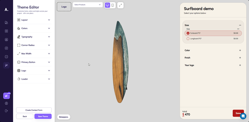
Primary button
The Primary button section controls the main action button in the configurator.
You can customize the following options:
- Button text — Change the label displayed on the submit button
- Border radius — Adjust the corner radius of the button independently from other UI elements
This section also includes the Open contact form toggle.
By default, clicking the primary button creates an order immediately. If you need to collect additional information from the customer, you can enable the contact form instead.
The contact form toggle is disabled until at least one contact form field is created.
👉 See Contact form setup to learn how to create and configure a contact form.

Logo
The Logo section controls how your brand logo appears in the configurator and generated documents.
You can configure the following options:
- Show in customizer — Displays the logo inside the configurator
- Show in PDF — Displays the logo in the generated PDF invoice
You can upload an image or GIF as your logo. If no logo is uploaded, these toggles have no effect.
After uploading a logo, a width setting becomes available. The height adjusts automatically to preserve the original aspect ratio.
Loader
The Loader section allows you to customize the loading screen shown while the product is loading.
Enable the preview toggle to immediately see how the loader looks while editing.
You can configure the following options:
-
Title — The loader headline text
-
Description — Text displayed below the spinner
-
Variant
- Plain — A solid background
- Grid — A subtle grid pattern in the background
-
Background color — The loader background color
-
Loader logo — Upload a logo or GIF for the loader. If no logo is provided, the Amaspace logo is used
-
Spinner size — Controls the size of the loading spinner
-
Show tips — Displays or hides the usage tip shown at the bottom of the loader
Step 3. Set up the contact form (optional)
By default, clicking the primary button in the configurator creates an order immediately. This works well when you do not need any additional information from the customer.
If you want to collect extra details, such as contact information or custom requests, you can enable and configure a contact form. When the contact form is enabled, the primary button opens the form instead of creating an order right away.
The contact form follows the visual styles of the theme, including colors, typography, and spacing, ensuring a consistent look across the configurator.
👉 See Contact form setup to learn how to create and configure a contact form.
Step 4. Assign products to the theme
In this step, you choose which products use the theme and which product is shown as a preview while editing.
Click the Assign products button to open the product selection modal.
In the modal, you can:
- Select products to which the theme applies
- Choose a product to use as the preview in the configurator
- Select all products at once using Select all (recommended when the theme applies to most products)
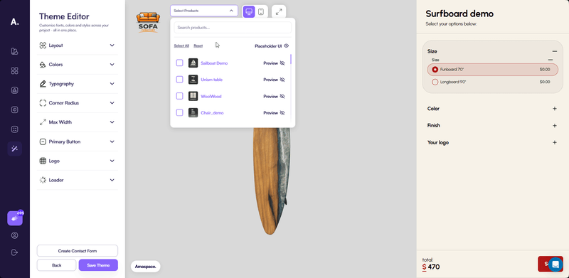
A default preview product is selected automatically. You can change the preview product at any time or switch back to the default one.
Keep the following rules in mind:
- Every newly created product uses the default theme until you assign a custom theme
- Assigning a theme to a product is always a manual step
- If a product is already assigned to another theme, assigning it to a new theme automatically reassigns it
- The product is removed from the previous theme and linked to the new one
Step 5. Save the theme
When you finish configuring the theme and assigning products, click Save theme.
A modal window opens where you need to enter a name for the theme. After entering the name, click Save theme again to confirm.
During this step, Amaspace automatically generates a preview screenshot of your theme and completes the theme creation.
Once the process is complete, your theme appears in the themes list and is ready to use.
Common issues
Contact form does not appear
If you do not see the contact form in the configurator, check whether the Open contact form option is enabled in the Primary button section of the theme settings.
The contact form opens only when this option is turned on and at least one form field is created.
New products do not use the theme
If you create a new product and it does not use your theme, this is expected behavior.
Each new product is created with the default theme. You need to manually assign your custom theme to the product after creation.